
Introduction
Creating visually appealing layouts is one of the most important aspects of modern web design. Whether you’re building a blog, portfolio, business website, or WooCommerce store, displaying content in an organized and engaging way can significantly improve user experience.
Grid layouts help structure content, improve readability, and make it easier for visitors to discover posts, products, services, and other information.
In this guide, you’ll learn how to create advanced grid layouts in Elementor using Impact Grid. We’ll cover everything from basic setup to customization and best practices.
Why Use Grid Layouts?
Grid layouts provide a clean and professional way to display content.
Benefits of Grid Layouts
- Improve content organization
- Increase user engagement
- Highlight important content
- Improve WooCommerce product visibility
- Create professional-looking layouts
- Enhance mobile responsiveness
Whether you’re displaying blog posts, products, portfolios, testimonials, or custom post types, grids offer a flexible solution for presenting information.
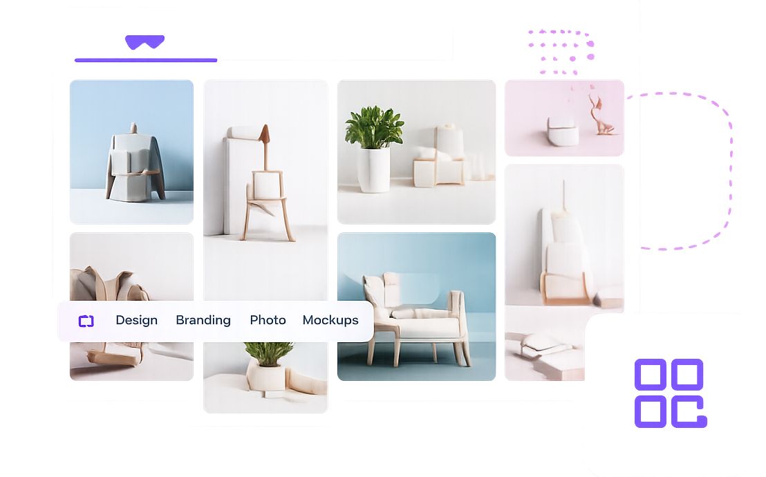
[IMAGE: Modern Grid Layout Example]
Types of Grid Layouts You Can Create
With Impact Grid, you can create various layout styles depending on your website goals.
Post Grid
Display blog posts in a structured and responsive layout.
Perfect for:
- Blogs
- News websites
- Magazine layouts
[IMAGE: Post Grid Example]
WooCommerce Product Grid
Showcase products with images, prices, ratings, and categories.
Perfect for:
- Online stores
- Product catalogs
- Featured product sections
[IMAGE: WooCommerce Product Grid Example]
Masonry Grid
Create Pinterest-style layouts with dynamic item heights.
Perfect for:
- Portfolios
- Image galleries
- Creative websites
[IMAGE: Masonry Grid Example]
Carousel Grid
Display content in a horizontal slider format.
Perfect for:
- Featured posts
- Testimonials
- Product highlights
[IMAGE: Carousel Grid Example]
Step 1: Install and Activate Impact Grid
Before creating a grid layout, install and activate Impact Grid.
Installation Process
- Download Impact Grid.
- Upload the plugin to WordPress.
- Activate the plugin.
- Open Elementor Editor.
Once activated, all Impact Grid widgets will become available inside Elementor.
[IMAGE: Plugin Installation Screen]
Step 2: Open Elementor Editor
Navigate to the page where you want to display your content.
- Edit the page with Elementor.
- Search for Impact Grid widgets.
- Drag the Grid widget onto the page.
[IMAGE: Elementor Editor Screen]
Step 3: Select Content Source
Impact Grid allows you to display different content types.
Available sources include:
- Blog Posts
- WooCommerce Products
- Custom Post Types
- Portfolio Items
- Services
- Events
Choose the content source that best matches your requirements.
[IMAGE: Content Source Settings]
Step 4: Configure Query Settings
Query settings determine which content appears inside the grid.
Examples:
Display Recent Posts
Show the latest published articles automatically.
Display Featured Products
Highlight specific WooCommerce products.
Filter by Category
Display only content from selected categories.
Custom Post Type Selection
Show content from custom post types.
Proper query settings help visitors discover the most relevant content.
[IMAGE: Query Builder Settings]
Step 5: Choose Grid Layout Style
Impact Grid provides multiple layout styles.
Common options include:
- Grid
- Masonry
- Carousel
- Ticker
- List Layout
Choose the layout that best matches your website design.
[IMAGE: Layout Style Options]
Step 6: Customize Grid Design
Customize the appearance of your grid.
Typography
Adjust:
- Titles
- Meta information
- Excerpts
Spacing
Control:
- Column gaps
- Row gaps
- Card spacing
Colors
Customize:
- Backgrounds
- Borders
- Hover effects
- Buttons
Responsive Settings
Optimize layouts for:
- Desktop
- Tablet
- Mobile
[IMAGE: Design Settings Panel]
Step 7: Enable Filtering and Pagination
Large content collections benefit from filtering and pagination.
Filtering
Allow visitors to quickly find relevant content.
Examples:
- Category filters
- Product filters
- Tag filters
Pagination
Choose between:
- Numbered Pagination
- Load More Button
- Infinite Scroll
These features improve usability and content discovery.
[IMAGE: Filtering and Pagination Settings]
Best Practices for Grid Layouts
Keep Card Design Consistent
Use consistent image sizes, typography, and spacing.
Avoid Too Many Columns
Three or four columns typically provide the best user experience.
Use High-Quality Images
Grid layouts rely heavily on visual presentation.
Optimize for Mobile
Always test layouts on mobile devices before publishing.
Highlight Important Content
Use featured grids to showcase important posts and products.
Common Mistakes to Avoid
Using Too Many Filters
Excessive filtering options can overwhelm users.
Inconsistent Image Sizes
Different image dimensions create messy layouts.
Overcrowded Grids
Too much information reduces readability.
Ignoring Mobile Devices
A large percentage of visitors browse from mobile devices.
Frequently Asked Questions
Can I create WooCommerce product grids?
Yes. Impact Grid supports WooCommerce products and allows you to create responsive product layouts.
Does Impact Grid support custom post types?
Yes. You can display custom post types such as portfolios, events, services, and more.
Can I create masonry layouts?
Yes. Impact Grid includes masonry layout support for dynamic content displays.
Is Impact Grid mobile responsive?
Yes. All layouts automatically adapt to desktop, tablet, and mobile devices.
Can I filter content without reloading the page?
Yes. Impact Grid supports AJAX filtering for a smoother user experience.
Conclusion
Grid layouts are one of the most effective ways to organize content and improve user experience. Whether you’re building a blog, WooCommerce store, portfolio, or business website, a well-designed grid layout can help visitors discover content more efficiently.
With Impact Grid, you can create advanced post grids, product grids, masonry layouts, and carousel layouts directly inside Elementor without writing code.
Start building professional grid layouts today and take your Elementor websites to the next level.
Ready to Build Better Grid Layouts?
Explore Impact Grid and create stunning content displays with Elementor.

