
Introduction
A well-organized product grid is one of the most important elements of any WooCommerce store. It helps customers browse products quickly, compare options easily, and discover items that match their interests.
While WooCommerce includes default shop layouts, they often provide limited customization options. Store owners who want more control over product presentation can benefit from custom product grids built with Elementor.
Using Impact Grid, you can create advanced WooCommerce product grids with custom layouts, filtering, pagination, sliders, and responsive controls—all without writing code.
In this guide, you’ll learn how to build professional WooCommerce product grids in Elementor and optimize them for a better shopping experience.
Why Product Grids Matter
Your product grid is often the first thing customers see when visiting your online store.
A good product grid helps:
- Improve product visibility
- Increase product discovery
- Create a professional store layout
- Improve mobile shopping experience
- Highlight featured products
- Increase conversion opportunities
Poor product presentation can make it difficult for visitors to find products, leading to lower engagement and fewer sales.
[IMAGE: Modern WooCommerce Product Grid Example]
What Is a WooCommerce Product Grid?
A product grid displays products in rows and columns.
Each product card can include:
- Product Image
- Product Title
- Price
- Category
- Product Rating
- Add to Cart Button
- Sale Badge
Instead of scrolling through long lists, customers can quickly browse multiple products at once.
[IMAGE: Product Card Structure]
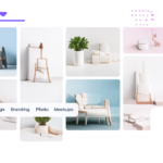
Types of Product Grids You Can Create
Standard Product Grid
Display products in a clean multi-column layout.
Best for:
- General stores
- Product catalogs
- New arrivals
[IMAGE: Standard Product Grid]
Featured Products Grid
Highlight specific products.
Best for:
- Best sellers
- Featured collections
- Promotional campaigns
[IMAGE: Featured Products Grid]
Category-Based Product Grid
Display products from selected categories.
Examples:
- Clothing
- Electronics
- Furniture
- Digital Products
[IMAGE: Category Product Grid]
Sale Product Grid
Automatically display discounted products.
Ideal for:
- Seasonal sales
- Clearance products
- Promotional events
[IMAGE: Sale Products Grid]
Product Carousel
Display products inside a slider layout.
Perfect for:
- Homepage sections
- Related products
- Featured collections
[IMAGE: Product Carousel Example]
Step 1: Install WooCommerce
Before creating a product grid, make sure WooCommerce is installed and configured.
Setup Checklist
- Install WooCommerce
- Add products
- Upload product images
- Create categories
- Configure pricing
A product grid requires products to display, so complete your WooCommerce setup first.
[IMAGE: WooCommerce Products Screen]
Step 2: Install Impact Grid
Install and activate Impact Grid.
After activation, you’ll gain access to advanced Elementor grid widgets including:
- Product Grid
- Product Carousel
- Grid Slider
- AJAX Filtering
- Query Builder
[IMAGE: Impact Grid Installation Screen]
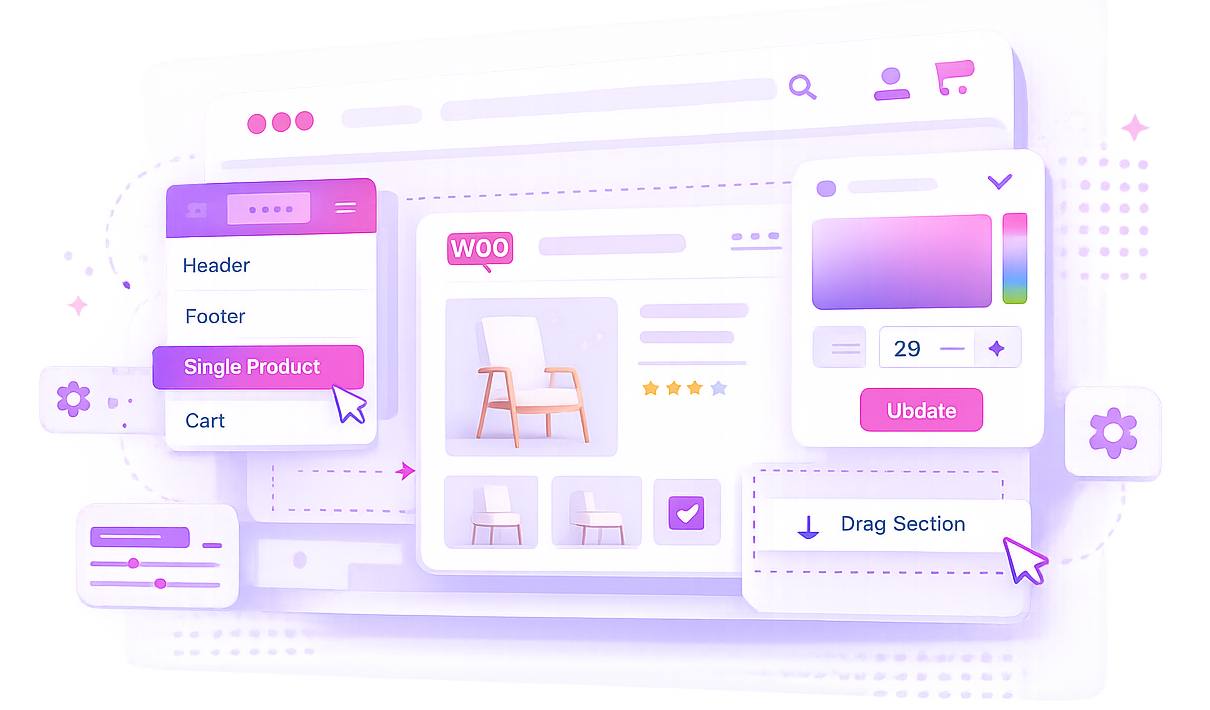
Step 3: Open Elementor Editor
Navigate to the page where you want to display products.
Examples:
- Shop Page
- Homepage
- Category Page
- Landing Page
Click:
Edit with Elementor
[IMAGE: Elementor Editor Screen]
Step 4: Add Product Grid Widget
Inside Elementor:
- Search for Product Grid.
- Drag the widget onto your page.
- Drop it into the desired section.
The widget automatically connects with WooCommerce products.
[IMAGE: Product Grid Widget Panel]
Step 5: Configure Product Query
The query determines which products appear.
Latest Products
Show recently added products automatically.
Featured Products
Display featured items selected in WooCommerce.
Best Selling Products
Promote products with strong sales performance.
Sale Products
Display discounted products.
Category Selection
Display products from specific categories only.
Proper query settings help visitors find relevant products quickly.
[IMAGE: Query Builder Settings]
Step 6: Choose Grid Layout
Impact Grid allows multiple layout styles.
Two Columns
Good for mobile layouts.
Three Columns
Most popular layout.
Four Columns
Suitable for larger desktop screens.
Responsive Layouts
Automatically adjust columns based on screen size.
Choose a layout that matches your store design and product count.
[IMAGE: Layout Settings Panel]
Step 7: Customize Product Card Design
Customize the appearance of each product card.
Product Images
Use high-quality product photos.
Product Titles
Keep titles short and readable.
Product Prices
Ensure pricing is clearly visible.
Sale Badges
Highlight discounts effectively.
Add to Cart Button
Use a strong call-to-action style.
A consistent card design improves store appearance and user experience.
[IMAGE: Product Card Design Settings]
Step 8: Add Product Filtering
Filtering helps customers find products faster.
Popular filter options include:
- Categories
- Price Range
- Product Tags
- Product Attributes
AJAX filtering allows products to update without reloading the page.
[IMAGE: Product Filter Example]
Step 9: Enable Pagination or Load More
For stores with many products, use pagination.
Available options:
Pagination
Traditional page navigation.
Load More Button
Load additional products dynamically.
Infinite Scroll
Automatically load products while scrolling.
Choose the option that best matches your store experience.
[IMAGE: Pagination Settings]
Best Practices for Product Grids
Use Consistent Product Images
Consistent image sizes create cleaner layouts.
Keep Product Cards Simple
Focus on:
- Image
- Product Name
- Price
- Add to Cart Button
Avoid unnecessary clutter.
Highlight Best Sellers
Featured products deserve more visibility.
Use dedicated sections for:
- Best sellers
- New arrivals
- Featured products
Optimize for Mobile
Most shoppers browse on mobile devices.
Always test:
- Product cards
- Filters
- Buttons
- Pagination
On smaller screens.
Common Mistakes to Avoid
Too Many Products Per Row
Crowded layouts reduce readability.
Poor Image Quality
Low-quality images reduce trust and professionalism.
Missing Product Filters
Filtering improves navigation and product discovery.
Ignoring Mobile Design
Responsive design is critical for WooCommerce success.
Frequently Asked Questions
Can I create WooCommerce product grids without coding?
Yes. Impact Grid allows you to build advanced WooCommerce product grids visually inside Elementor.
Can I display products from specific categories?
Yes. You can filter products by categories, tags, attributes, and custom queries.
Does Impact Grid support AJAX filtering?
Yes. Visitors can filter products dynamically without reloading the page.
Can I display sale products automatically?
Yes. Product grids can automatically show discounted products.
Can I create product carousels?
Yes. Impact Grid supports both grid and carousel layouts.
Is the product grid mobile responsive?
Yes. All layouts automatically adapt to desktop, tablet, and mobile devices.
Conclusion
A professional WooCommerce product grid can dramatically improve product discovery, store organization, and the overall shopping experience. Instead of relying on standard WooCommerce layouts, you can create fully customized product displays that match your brand and help customers find products faster.
With Impact Grid, building advanced WooCommerce product grids inside Elementor is simple, flexible, and completely visual.
Whether you’re running a small online shop or a large product catalog, a well-designed grid layout can improve engagement and help drive more sales.
Ready to Build Better WooCommerce Product Layouts?
Explore Impact Grid and start creating professional product grids with Elementor today.
Suggested Screenshots
[FEATURED IMAGE: WooCommerce Product Grid Layout]
[IMAGE: Product Grid Widget]
[IMAGE: Query Settings]
[IMAGE: Layout Options]
[IMAGE: Product Filter Example]
[IMAGE: Final Product Grid Frontend]

